Balancing Brand and Usability for Ecommerce Experiences: How to Delight Your Customers
In ecommerce, creating a pleasurable and seamless experience for your customers is essential for building brand loyalty and driving sales. However, it can be challenging to balance your brand's visual identity with a user-friendly interface that guides customers smoothly through the buying process.
Before I cover this balancing act, it’s important to understand conversion rate optimisation (CRO) and user experience (UX) are not interchangeable. CRO is a practice to improve business outcomes, driven by sales. UX is more of a long game and is much less black and white.
If you want any easy way to improve your conversion rate, you can focus on driving lower volume but higher quality traffic to your site. It’ll improve the numbers, but not the experience.
Here I’ll outline some exercises and strategies you can utilise to build better web experiences that still showcase your brand identity and perform well against business metrics.
Brand graphic elements and their prominence in the customer journey
One way to balance brand and usability is by focusing on graphic elements and the impact they have across stages of the user’s experience. It's important to showcase your brand's visual identity throughout, but it should not interfere with the buying process. Start big with your visual motifs and gradually tone it down as the customer approaches the transactional stage. Aesthetically pleasing sites have been shown to positively improve the perception of brand and the site’s transactional performance.
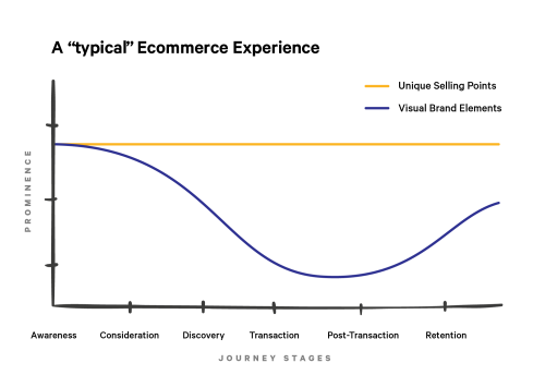
For example, your homepage can feature bold visuals and colours that capture your brand's look and feel. But as customers progress to product pages and checkout, the branding should become more subtle to avoid distraction from the core user experience.
Additionally, post-purchase communications and retention efforts can go back to showcasing the brand's imagery, graphic motifs and visual flavour to ensure brand impact, usability and performance.
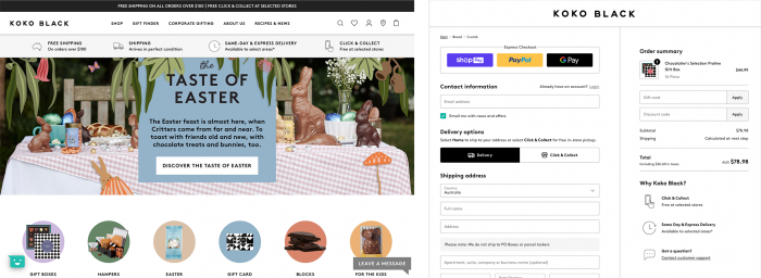
Homepage and checkout for Koko Black, Designed by Convert Digital
Brand is more than visual design
The services and unique selling points a brand has are just as impactful as what typeface or colour was chosen from the brand guidelines. A useful workshop exercise is to gather every unique component of a merchant’s offering - from its number of physical stores, free shipping or product range, and then assign it to different site pages. Then, order them top to bottom by importance, creating an organised framework of messages to communicate. Ready for you to utilise design principles like typographic hierarchy, scale and contrast that communicate the most critical points with impact, but avoids overwhelming the user with so much information that they struggle to retain anything.
I’ve created a free Figma template to get you started:
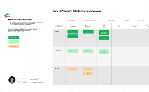
Figma Customer Journey USP Mapping Template
Empathy through regular website testing
Regular website testing is another critical component of balancing brand and usability. You can embody a different user persona each week and test different aspects of the site. This includes testing different landing pages, products, payment methods, and order delivery methods.
A pretty button that takes you to a 404 page is as useful a fly screen on a submarine.
Being user-centric in design is more than understanding user needs through a journey map. It's also about experiencing the site as a user yourself, but embodying the different types of experiences your different users might have. By doing so, you'll gain a unique perspective on the site, discover new opportunities for improvement, and ensure that your design is customer-focused.
Website testing spreadsheet template
Analytics: The sweet spot between quantitative and qualitative insights
Finally, when balancing brand and usability, it's important to use analytics to your advantage. While quantitative insights are useful in determining where to focus your time and energy to get the best returns, for example: should we spend 25 hours improving a landing page no traffic is being sent to? Qualitative insights are also important for understanding how your customers feel and better understand what they need to make a purchase decision, as well as how they perceive a brand.
When undergoing user testing on a tool like UsabilityHub, ask open-ended questions like "What does this brand sell?" or "What was missing from the website to help you?" The answers are always a delightful surprise from a fresh perspective, for better or worse. Collating these responses will help you you identify new features or business initiatives that you would never get from analytics alone. You might get some answers you won’t enjoy, but don’t take it personally. Use them motivators to create a better experience for all (even the grumpy customers!).
A brand’s visual impact is underpinned by how users interact with it. It’s helpful to think of websites as evolving communications, not page layouts that are sent to developers. By focusing on graphic elements upfront to garner attention, regular website testing to make sure it works, and feedback to make sure it’s having impact, you can build experiences that’ll delight customers and keep them coming back time again. Your boss might like the figures too.